*I could not find the cover artist for some of these so if you know it list them in the comments below and I will edit the post.
**Also, my analysis is based on seeing these covers online so there probably are so many elements that I am going to miss.
***have not read the synopsis or cover reveal (skimmed to find the cover designers) for most of these but know what they are vaguely about so there are obvious clues to the analysis that I may miss there too.

Children of Blood and Bone
Author: Tomi Adeyemi
Cover Designer: Rich Deas
I already talked a bit about what I liked about the cover and reviewed first six chapters here.
Background: Completely black which I think is to emphasis the whiteness of the girl’s hair.
We have a view of the main character from her hair to middle of her face. One of the most striking parts of the cover is the darkness of the characters skin (the darkest that I have probably seen on a young adult book cover). Her skin has brown or yellow symbols (this is one of the elements that I think will be better analyzed in person). Her hair is bright white and her eyes are a light blue or grey.
The shadowing and the colors makes this feel very vibrant I would not be surprised if the cover is in that velvety cover material.
Her hair is straight bright white sticking up with a red, blue, and other colors head scarfs. There is a white chain thingy with beads on it and a blue jewel in the middle. There is white symbol lines sitting on both sides of the jewel going down her forehead. I can not tell if the jewel has something in it or not. The title is sitting in her hair (there are parts of the hair that is looping around the words).
Cover Reveal
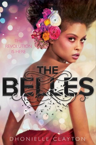
Tagline: The revolution is here
Author: Dhonielle Clayton
Artist:
Point of view: We are shown the back of the girl with her looking back at us.
Background: light flashing like what usually is shown in glamour Hollywood book covers.
On side of her of her hair we can see her hair is sticking up in a fohawk, with an assortment of different color and type of flowers covering a large portion of her ear. Her dress is pink with a white top. Out of all the book covers I think her face looks the softest because of how she is sitting her mouth. Her mouth is slightly open showing a bit of her teeth, a look that a lot of models have in photos. Her facial expression does not have the determined/serious look the others have she is looking more in wonderment (I wonder if that says something about who she is as a character?).
The title words seem to be breaking apart. There are black swiveling lines that are breaking apart the word “Belles”
Cover Reveal

Tagline: Rise Up.
Author: Justina Ireland
Cover Designer: David Curtis
Background: There is a big dingy, probably more because color of photo than anything, American flag in the background laying like it has fallen the rest is black
Point of view: full back of girl in front of American flag
She has braids which make sense if she is fighting zombies but they are long so the zombies could grab one of the braids (but also it makes me think of action scenes where the character is fighting with their hair flying in the wind, I like it) Did you not notice that she is holding a bloody curved knife looks like a shortened sickle or hook? Is she wearing a long coat or a long dress? The outfit signifies this is in the pre/post-civil war. The cover is very dark, background and characters clothes are black. The character has a somber or serious facial expression looking off into the distance, makes sense for someone who has just fought zombies.
Overall look makes me think of an old photo.
Cover Reveal
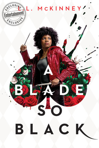
A Blade So Black
Author: L.L. McKinney
Cover Designer:
Background: white and crème rhombus checked pattern, author name is in red on top of cover
Words: A blade is in white so black is in black it feels like the image is siting on top of the white, the K on black is elongated
Image: black girl with naturel hair (afro) holding two small knives, inside queen of spades silhouette with red and pink roses in the background (notice that the spade has paint splatter imagery reminiscent of Alice In Wonderland where Queen of Hearts has her guards, if I remember correctly, painting white flowers red). Also, it looks as if the girl is bursting out of the card because the painted image inside the spade is painting over the white and crème patterned background (bringing color). The girls gaze is off in the distance not looking at the viewer. Is she looking at the queen of hearts? preparing for a fight? She is obviously in a fighter stance.
The image of the girl with the two knives makes me think of those pictures/videos of someone playing the drums with paint. The paint is splashing out like she is sounding the revolution.
Cover Reveal
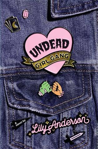
Undead Girl Gang
Author: Lily Anderson
Cover Designer:
Background: Blue jean jacket
Point of view: focus is on one of the shoulder pockets
There are pins throughout the jacket (7 in total)
Top
(1) pink stone (diamond?)
(2) partially spread deck of black cards, showing only the face of one card which shows a gold crescent moon
Bottom
(3) zombie green hand with pink nails (decaying) pinky swearing with a brown hand with black nail polish and pink bracelet with star (occult?) in the middle
(4) author name in cursive pink with black outline with gold stars on certain parts around it
(5) sword with black hilt with pink or silver blade, black outlined
(6) little black banner off to the side that has in white lettering a novel by
(7) Biggest pin is pink heart with “Undead” in black (horror font) “Girl Gang” in black lettering in gold banner at bottom
Cover Reveal

